Anthropologie has given its website a makeover! It’s a much more significant set of changes than the recent incremental differences. From order histories to product pages to the navigation just about every piece of the user experience has been changed…sometimes for the better and sometimes not so much. Let’s take a look at the new stuff together, shall we?
It’s already hard to remember what the website used to look like, but you can take a dip into the recent past in this post, and take a look further back via posts 1, 2 and 3.
THE HOMEPAGE & NAVIGATION BAR
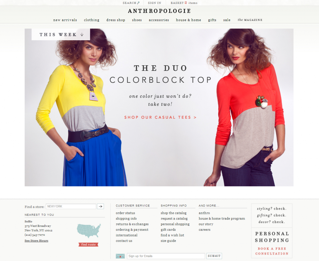
I like the homepage redesign. There’s a metric ton of important information to put on a retailer’s greeting page and Anthropologie’s website creative team has come up with some elegant solutions. I love how the main area of the page continues to grow more visual with each redesign. The photo area takes up more and more space and for a clothing retailer that’s a good thing. Pretty pictures of people in cute outfits make me want to shop!
The bottom utility part of the homepage is well-sorted now, perhaps taking up a bit too much space overall in my opinion but easy to parse. I love that my nearest store is now prominently displayed and how the customer service links are organized. Well done Anthropologie!
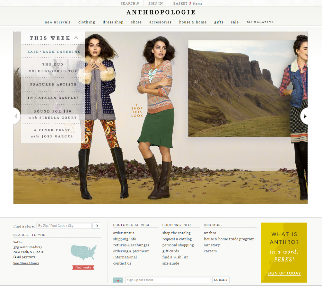
Also getting a makeover is the navigation bar, which has turned into a fancy trick of the hide/display code. I like the omnipresence of the search/sign in/basket at the very top of the page. It’s a good, natural placement for those key site functions. But I hate how you now have to click on “search” to expose a search bar. It’s especially tough on an iPad or phone, where it’s all too easy to click the Anthropologie logo instead of the search button.
While I’m happy to see the left navigation bar gone in favor of drop-downs below each category at the top of the page, I hate the way the menus expand by pushing down the rest of the page. It’s like those super annoying ads that trickle down from the top of a website, pushing all the content in a way that makes my eye hurt. When you’re done with the menu the snap-back effect is equally headache-inducing. Despite that complaint, I do like the menus themselves, which make it easier to hop around the site. It’s cool how there’s the basic navigation in one pane (i.e. Dresses, Tops, etc.) and some more specialized pages next to it in another pane (i.e. Knit & Jersey Dresses, Online Exclusives, Top Rated, etc.). The little graphic touts are cute too. It will take some adjustment to get used to this new way of navigating the site. But I like it.
THE PRODUCT PAGE, FIND IN A STORE & PRODUCT REVIEWS
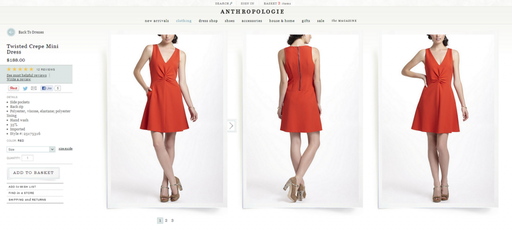
The product page has been completely overhauled, flipped around and reversed. The product details now live on the left side of the page, while over 80% of the horizontal space now belongs to the product shots. (Still hate the model shots Anthropologie. Bring back dress forms!) And that’s all that makes it above the fold. Reviews, upsells, similar items, and a very cool sizing guide have all been pushed below what you see when you first arrive on the page.
I’m less than satisfied with this particular design. The user experience is stymied. First, the lovely little copy paragraphs that used to top every product page have now been pushed into an “Editor’s Notes” section that lives below the product reviews. That’s a long way to travel to get the brand information. I’ve been complaining for awhile about how annoying it is that the coordinating items aren’t listed out — for example on the Twisted Crepe Mini Dress ($188) page above you’d have to go hunting to find the Furina Mary-Janes ($100) shown with them in the product shots. Some product pages, such as the Tiered Pointelle Sweater Dress ($148, review) product page, have a “Get the Look” stamp where the product upsells from the catalogue shot are shown in one convenient grid. But it’s not consistently done on every page with a catalogue shot and it’s never done for model shot-only pages. Boo. For an item with a catalogue shot, I wish that picture was the first photo you see.
The biggest user experience mystery has to be the new “Find in a Store” feature. This little link is hidden below the “Add to Basket” button (which is itself not prominent enough in my opinion…) and is something the community has long been asking for. I’m delighted to see it unveiled but I’m not sure it’s ready for prime time.
My first and biggest qualm with this Find in a Store feature is that you can only search for items in sizes available on the website. This is horrible misjudgment of use cases. Isn’t the exact point of a store search feature to be able to find sizes that are sold out online? Because if it’s still in stock online what’s the point of even searching for it? I’ll just buy it from the website! So if I’m a size 10 and my size is sold out online, 10 doesn’t even appear as one of the sizing options to search for in a store. Huh??!? I’m mystified by this decision.
Another qualm is the limited search parameters. The shortest distance I can search is 50 miles. Let me tell you that as a NYC resident I’m not going 50 miles for an item. I would love a 5 mile option. And even when I lived in Connecticut the likelihood of me driving 50 miles from East Norwalk to, say, Farmington, are zero. No chance. I guess I would be driving from Fort Collins, CO down to Boulder or Denver to buy an item since Northern Colorado was (and still is) a no-Anthro zone when I lived there. But you get my drift. On the Store Locator page there’s a 10-mile radius option. Why isn’t that an option on the Find in a Store tool?
Reviews also get a bit of a makeover. I love how there’s a “View the most helpful reviews” link right below the stars. But when you click on it, it just takes you to the first three reviews. It doesn’t sort them by helpfulness. I dislike that you can only see the first three reviews which seem to be random. And I hate that there’s no way to “View All” reviews. There’s nothing I hate more than having to click and click and click to see information. View All is your friend, Anthropologie.
On One last note: Please kill the “no” option for whether a review was helpful or not. Let people vote a review helpful. There’s no reason to vote a review down.
YOUR ACCOUNT
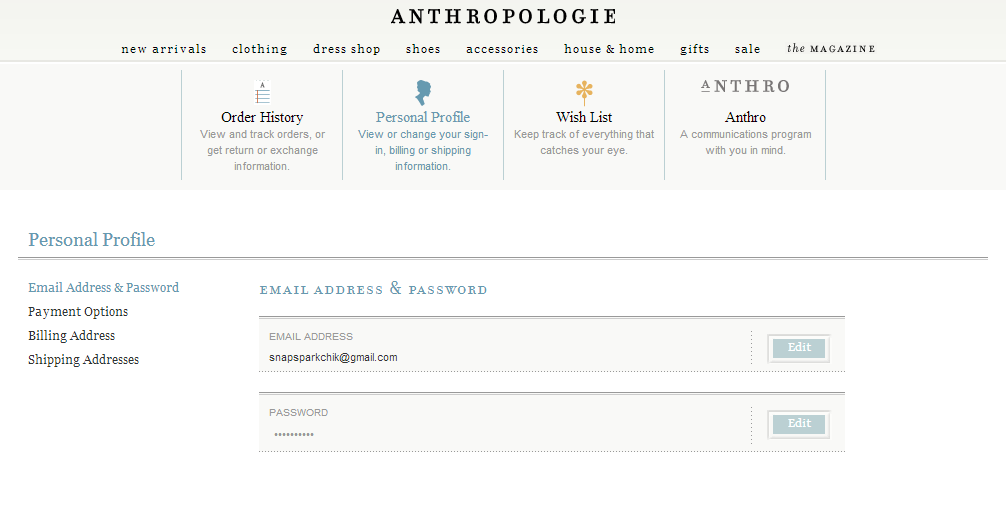
When you sign into your Anthropologie.com account, you’re now taken to a nice little dashboard. This section has vastly improved over the previous design. I love the little icons at the top for each section (i.e. Order History, Personal Profile, etc.) and wish those were used more. Visual cues are helpful, Anthropologie!
ORDER HISTORY & WISHLISTS
Though it’s still loading quite slowly for me, the Order History section is laid out much better than it used to be. The product photos are just a bit larger and the product information is easier to glean. But I noticed some oddities. For example my order above shipped to me about three weeks ago yet it’s still labeled “Preparing to Ship.”
It would be nice if the system was a little smarter too. There are buttons to review products next to everything you order — but what if I already reviewed something? It would be cool to have a “View My Review” button in that case. In fact, there’s not much ability to change, update or control reviews and that’s too bad.
The wishlists themselves haven’t changed much as of this writing, except that the “DELETE” wishlist button is now perilously close to the list of wishlists. I have a laundry list of ways this section could be improved but I’ll hold back for now to see what Anthropologie does. They’d better not kill wishlists.
SHOPPING CART — I MEAN, BASKET
And finally, our carts have gotten a smooth-looking update that’s very visual and quite lovely. Though I’m annoyed that the size, color and quantity dropdowns have disappeared, I quite like the new icons to the left of each product. Click on “See Reviews” for instance and they open in-line which is pretty cool. I also like how hovering over the product shot shows the back photo. I just wished it continued to cycle through all the available photos, which would be incredibly helpful for things like shoes and boots.
I’m also glad to see that you can move sold out items to your wishlist, an option which had disappeared at times. It’s very important in the popback hunt!
Those are my initial thoughts on the redesign. Community, what do you think of Anthropologie’s new look?


