
It seems like every few months Anthropologie’s website gets a new look. This morning though it was a whole redesign we woke up to! With each successive update Anthro’s site looks less like the unique creature the store is and more like a classic ecommerce site. Let’s dive into some of the changes, shall we?
On the homepage, a 3-slide HTML show replaces the flash slides we’ve seen over the last several months. It’s an easy way for Anthropologie to showcase several vignettes at once. I like it, but I hate how the show jerks back to the left after three successive slides to the right. In fact it kind of gives me a headache. Here’s hoping they tweak the code to make it an infinite right scroll sometime soon.
Below the main area are 4 new callout boxes. These are a staple of ecommerce sites. Interestingly, though these are normally used to call out specific products or specials (i.e. Free Shipping on orders of $150+ through 7/15) Anthropologie has used the area to tout their side projects, like their tumblr Etymologie and their wonderful Anthropologist site. I’m curious about the thought behind this — you’re basically pulling visitors away from your site right from the homepage. I suppose for people like me who visit the site approximately 85,698,231 times a day this is another distraction that’s Anthropologie-centered.
And finally, the navigation bar has been straightened out and made smaller(??). In fact just jumping to the clothing is know the hardest part of this homepage visually. My eye goes to the moving pictures first, then the boxes and finally the top account area before finally locating the nav bar. It’s a lot to take in!

Changes abound inside the site as well. The product photos are more straightened and uniform than ever before. Long gone are the soft double borders around the photos and paperlike product callouts below the photo. The photos themselves are smaller than they used to be, though I am relieved to see the “view all” does not shrink the product photos as many other clothing sites do. I like my product photos as big as possible and Anthro’s still make the cut. I hope they don’t make them any smaller though.
Within the product page the functions are all there though I see the product upsells (now on the bottom of the page) still show other products in the same section instead of actual coordinating items. Boo.

The side nav has gotten its own update to standard and kind of boring. Still missing: tall, petites, and peep the catalogue. Lounge and beauty has its own button on the top navigation now so it’s gone from the side. Bags has been kicked out of the shoes section and into accessories, which is interesting. It took me a few minutes to find a few sections but the new organization makes sense to me.
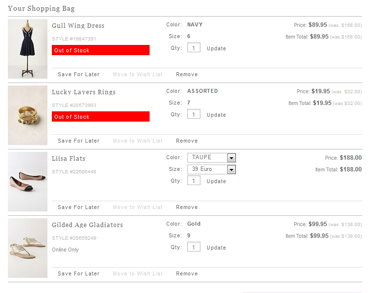
In the shopping cart, it appears the rich HTML cart with the horrible scrolling ‘saved for later’ portion is dead, dead, dead. (YAY!) The plain old HTML version works just great in my opinion. A few sharpened details highlight a mostly unchanged page.
And that’s really the thing — change is good, but sometimes you don’t need to mess with a good thing. I like the new site fine. I liked the old site too. There are some features from the two versions ago site I’m waiting to see return but otherwise this new look isn’t likely to change my shopping habits at Anthro. I know there are large changes going on behind the scenes right now as Anthropologie is implementing an overhauled inventory system. THOSE are the changes I’m really interesting in seeing and hearing more about.
What do you think of the design?