Anthropologie is redesigning their website more often than I can keep up with! The layout and features seem to be changing every week. Inside, thoughts on the latest updates and some unsolicited feedback.
SHOPPING CART
Instead of my usual starting spot in evaluation I’m going to begin this post by discussing the shopping cart. It seems to be the area most challenging to adopt.
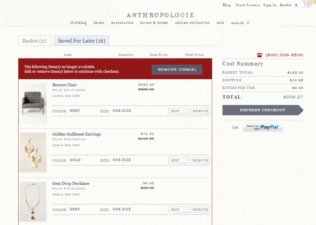
Anthropologie has taken steps to try to make its shopping cart design clearer and cleaner. I like the font weight of the item name and price. It’s very clear when an item goes on sale and the color/sizing information is well organized in a bar with the option to edit an item in your cart or remove it. The item photo is a good size and I really like the “Just a few left!” message even though it sometimes trips my impulsion…which of course is exactly what Anthropologie wants. The customer service phone number is clear and easy to find. Seeing the estimated tax is also great.
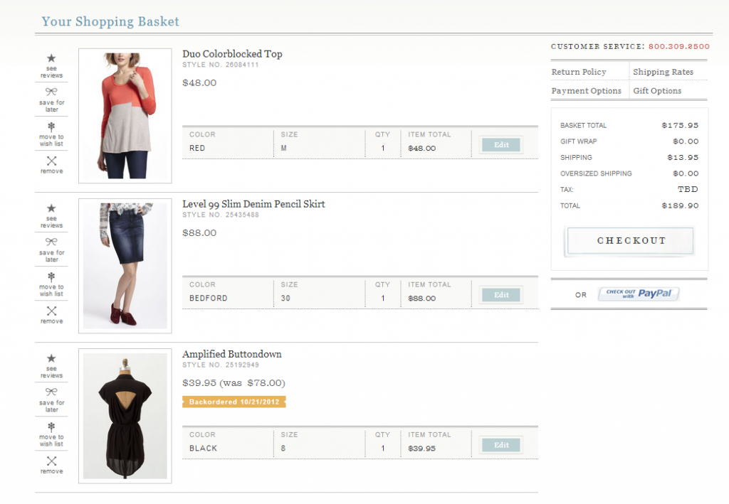
I miss the 4 buttons that were to left of item photos: see reviews, move to wishlist, save for later, remove. To jog your memory, below is how the cart looked a year ago.
It would be great to have those buttons back, but overall I do like the 2013 version of the cart much better. It’s cleaner and easier to navigate. All the blocks and boxes were confusing. Also note that the checkout box in the 2012 version seems to just blend into the background while the new checkout box is clear and stands out without dominating. (Hooray for arrow checkout boxes in a high-contrast color!)
The 2013 cart, however, has a few problems. First and foremost, the huge red out of stock box that encloses any sold out items is intrusive and unfriendly. I appreciate clearly knowing when an item is out of stock — really! — but every item is double-listed in the out of stock box at the top of your cart and then again below it, often with the “Just a Few Left!” message. It’s so confusing! Items should only appear once. And if it’s sold out an item shouldn’t say Just a Few Left. Because there are none left.
In the latest update, pushed live Sunday night, you can no longer move sold out items to your wishlist or save them for later. I truly hope that’s an oversight and that those two critical features are both coming back. Items pop back into stock so often; to not be able to track that is a travesty. I’d go as far as saying I’d rather keep a sold out item in my cart than checkout an order even if there’s in-stock items I’d like to buy, so Anthro is costing themselves revenue here.
One final bit of confusion is the checkout button itself. It says “Express Checkout.” That in and of itself is fine. The problem is that Express Checkout implies that there are two options. Express and not express. Well, where’s the non-express option? How do I access it?
In terms of placing an order I haven’t hit any bugs in the checkout yet with two orders placed in the last two weeks. Have you? If so, please let us know in the comments. (And if not, kudos Anthropologie!)
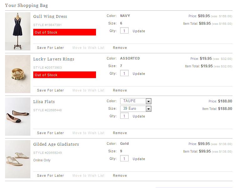
How far has Anthropologie’s cart come? Here’s what it looked like in the summer of 2011:
Aside from liking the OUT OF STOCK bar way better on the old cart, I’d say the new version has a much more pleasant design.
PRODUCT PAGES
Anthro can’t seem to leave it’s product pages alone for very long. In the last two years we’ve gone from one large dress form product shot to three model shots, often appended by a detail shot, and about 10 different layouts of the product details/cute copywriting/reviews/functional product attributes.
Last summer Anthropologie’s convention was one large product photo on the left side of the page with the cute copy, details, and functional product attributes on the right side of the page with reviews either in their own tab or along the bottom of the page.
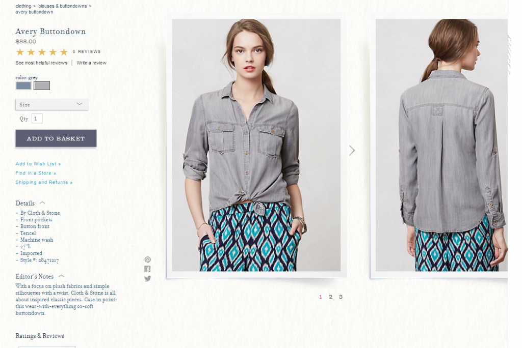
Now the product page looks like this.
Reviews are just below where my screenshot cuts off. Just this morning Anthropologie made a change where the Details and Editor’s Notes have been swapped in page placement and the Editor’s Notes are collapsed when the page first opens. (Last week Editor’s Notes were on top while Details were below and collapsed.)
Anthro’s product pages have a lot of important information to display. To me, the information is out of order on this page. I get why the sales and marketing folks would be like “Add to Basket button on top!” But as a customer, my eye reads in this order:
1. Product photos
2. Product star rating
3. Details
4. Cute copy (Editor’s Notes.)
5. Reviews — to read them now
6. Find in a Store
7. Add to Cart/Wishlist
Right now my eye has to jump around a lot to disseminate the information in that order. I realize not every customer reads the information in the same way so perhaps in testing this layout tested the highest. My e-commerce experience makes me dubious.
I love having the reviews at the bottom while the star rating lives right below the item name. I love the font serif font chosen, though I don’t think it should be used as much as it is now, and I don’t think the mobile site should have serif at all.
Here’s what I’d like to see changed on this page:
1. Product photos should be larger with thumbnails beneath the main image rather than a side scroll.
2. The photo should be on the left, details on the right as most people read left to right.
3. Instead of text links, add to wishlist/find in a store/shipping details should be buttons with alt text
4. The product details should be in a sans serif font which makes them functional rather than editorial as they seem now
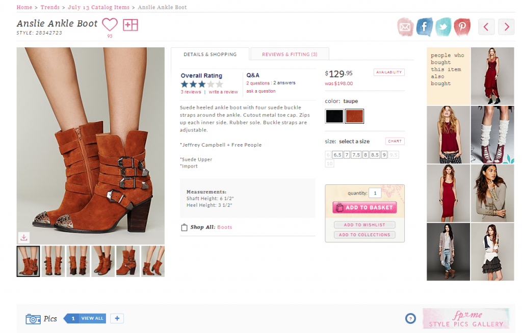
In fact, you know whose product page I like a lot? Anthro’s sister brand, Free People.
I feel like Emeril looking at it. BAM! There’s the product photos. BAM! There’s the reviews. Etc. It’s all pretty much in the order I want it. There are some elements of Anthro’s page I like better — the sizing dropdown and reviews placement for instance. I also like the background on Anthropologie’s page a ton. But overall Free People pretty much nails it. No wonder my wishlist and online purchases keep growing with them. This month I’ve bought the Anslie Ankle Boots you see above as well as the Engineered Stripe Cowl and the Mod Stripe Tunic. (Love them all, the Mod tunic is very itchy though. You have been warned.)
INVENTORY
Tangentially related to product pages, although in my view Anthropologie’s gotten a lot better about inventory tracking recently it remains one of the community’s biggest complaints.
Here are the issues I hear about most frequently (am I missing any?)
1. Items selling out in the end sizes (0/2/14/16) or popular sizes too quickly
2. Customers being able to place orders for items that are in reality sold out
3. “Ghost popbacks” where an item appears to be in stock due to a mismatch between Anthropologie’s warehouse and inventory system but there’s actually not availability
4. Items selling out super quickly
Let me address number 4 first. In a savvy business tactic, Anthropologie is in fact placing smaller inventory orders for many of its items. With in-house brands it’s because their production process is now nailed down enough that they can get more inventory in 4-6 weeks if an item sells through quickly. With third parties I think Anthropologie has made the choice that it’s better to sell out of an item and create demand for subsequent new releases than it is to have stock left over to mark down. And in some cases third party brands have been able to quickly fulfill second or third orders.
So while it’s no fun when, say, the Crocheted Tights ($39) sell out in your size within a week of appearing on Anthropologie’s website (boo), I get it and I don’t think it’s a bad thing for Anthropologie as a business at this time.
The ghost popbacks are an annoyance, mainly because the technical team doesn’t seem to have a way for the warehouse to fix the inventory manually. (I find this very, very hard to believe.) And while I’ve been bitten myself by placing an order for a dwindling item only to get the dreaded cancellation notice, I’m not sure how Anthropologie can fix this without getting either more database power behind their website with some kind of blazing fast replication that allows it to have near real-time inventory tracking (doable but expensive) or perhaps putting in a fail-safe measure where items appear sold out on the website when in reality there’s maybe 5 of that item/size left to try to catch all the orders before people can buy past inventory levels.
Number 1 is a good problem to have for Anthropologie but a challenging one. Because it’s impossible to say which items will be a hit with customers beforehand, and especially which sizes of customers, Anthropologie typically orders the most of middle sizes and less of the so-called fringe sizes. An item might turn out to be really flattering on plus size figures for instance, leading the 14s and 16s to be gone, or it might be the kind of item that lends itself more to the petite and so the 0s and 2s are gone in a flash. As a size 9 in shoes I see my size gone first so often, a complaint I’m sure size 5.5s and 10s share.
Another issue is that for Canadians an item may appear in-stock online, but really isn’t for them. Because Anthro’s store and warehouse inventories are linked (yay!) if an item is available for store drop-ship then it’s basically sold out for Canadians, because Anthro doesn’t allow its USA stores to ship to Canada generally. That’s a big boo.
WISHLIST
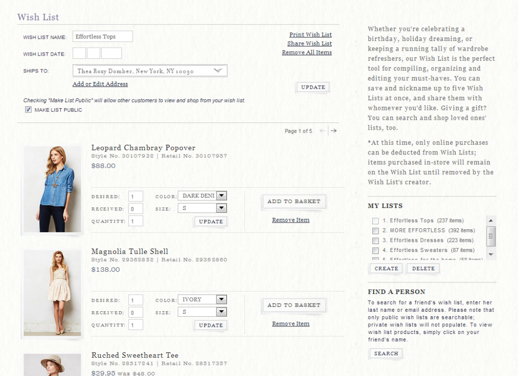
Seems like the most frequently voiced issue right now is that people’s wishlists are disappearing. It’s hard to say if that’s because of a database issue on Anthropologie’s side (which happens and is unfortunately very hard to fix if corruption is the issue) or if it’s user error.
Aside from that unfortunate problem I rather like the wishlist right now. I wish I could see all my items on one gigantic scrolly page of goodness, but other than that it works great and does what I need it to. What do you think?
MOBILE SITE
I really like Anthro’s iPad app but the updates don’t come frequent enough for this multiple-times-a-day site visitor. I’ve stopped using Anthropologie’s website on my iPad altogether because it keeps crashing — too many dynamic threads that eat up the memory in Safari until it goes kaboom.
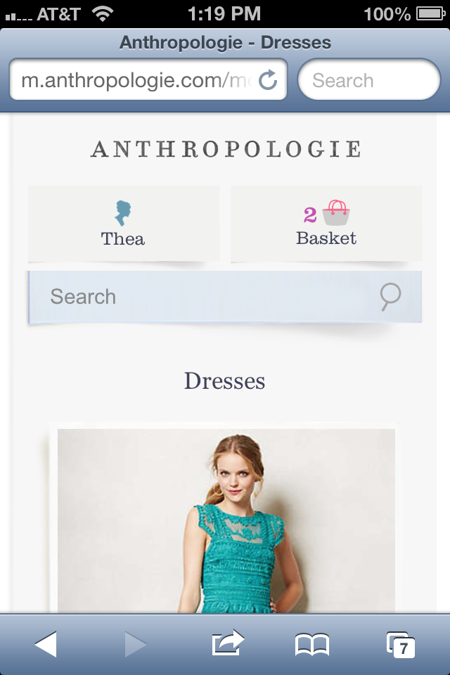
On my iPhone the site is pretty OK. I know that sounds like faint praise…I guess it is. If I know the name of the item I’m looking for the iPhone version of the site is great. I just Google the name, click to Anthro’s mobile site and I have all the details I need.
However, if I need to do any kind of search or scrolling or sign into my account on Anthro’s website it’s a pain in the butt. I prefer to just go to the Full Site, even though the buttons are so tiny and it’s not perfect, because at least I can see multiple items at once and kind of use my 20/20 vision to find the little rectangle of the treasure I’m looking for.
CATALOGUES
It appears that Anthropologie is getting back into the habit of making its catalogues available on its website — here’s the October “lookbook“. But wither your archives, Anthropologie? I miss being able to scroll through books from 2012, 2011, 2010 and so on back to your brand’s debut in 1993. Cooommmmmeee on. Bring the old catalogues back!
Or at least start saving them again with this month. It’s a kindness on your part that would be much appreciated.
Community, what feedback do you have on the Anthropologie website’s latest iteration? What did I forget to talk about here? What would you like to see in future iterations?

